The identity, laid out.
Everything that makes a can of Drift look like a can of Drift: a wordmark that is just the word, a stamp that says how long we waited, four colours and three more for the flavours, one serif with opinions, and a way of moving that never snaps.
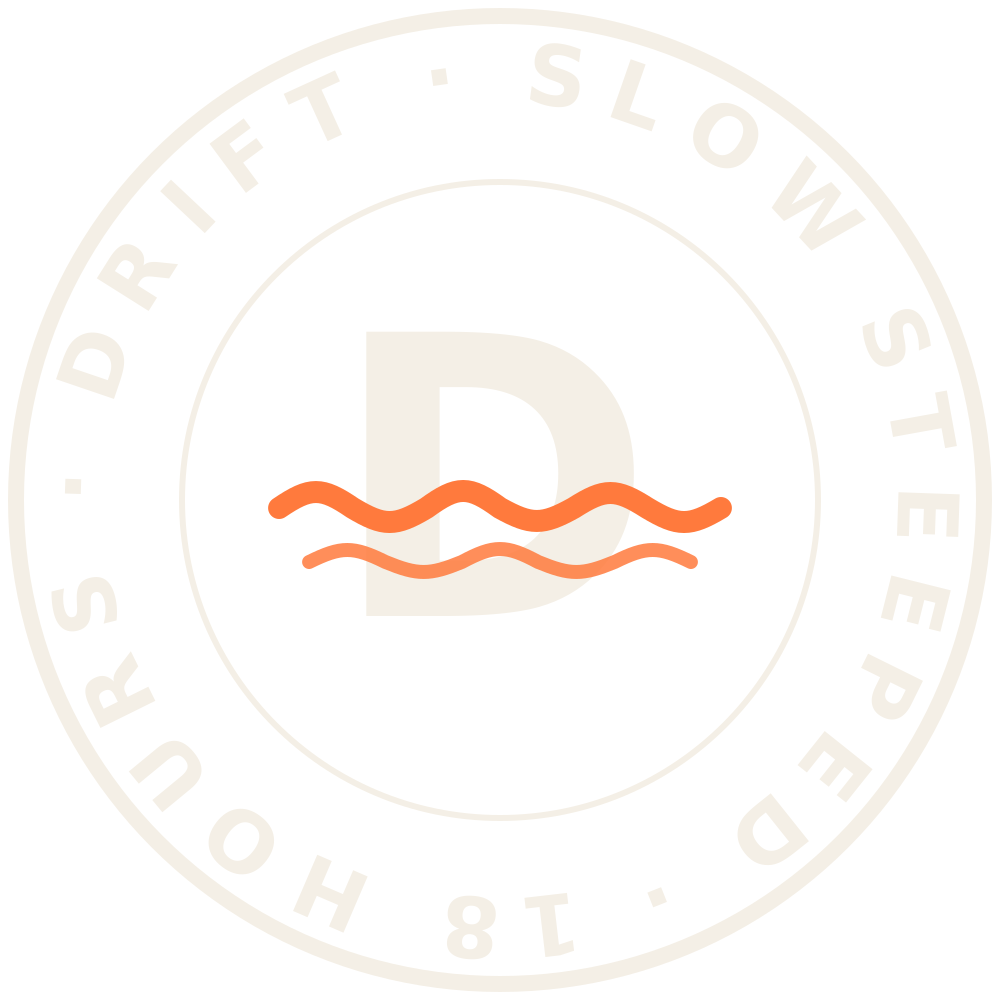
The wordmark is simply the word, set in Fraunces at its heaviest and softest, as live text everywhere it appears, and as SVG text in the same font in the logo files. The tide lives in the stamp: the only claim we make, slow steeped, eighteen hours, rotating slowly wherever it appears.

Live textNav, footer, loader and this page set the wordmark as real text, so it inherits colour, scales with the type and stays selectable. Never re-track it; never add an effect to the letters.
Fraunces, as iswght 900 · SOFT 100 · opsz 144 · WONK 0, tracked −0.035 em. The SVG files use <text> in the same font, with a tiny embedded subset so they render anywhere. No redrawn letters, no effects.
StampRing text set in Fraunces 650 at 14 opsz, letterspaced to close the circle exactly. The D in the centre carries the same tide in Tangerine. Minimum size 24 px; below that use the favicon disc.
Cream is the paper. Espresso is the ink. Tide is the colour of the deep end and Tangerine is the colour of a thing you reach for. The ratios are real: measure a page and it should come out close to 60 / 25 / 10 / 5. Click a swatch to copy the hex.
Fraunces does the talking, with its optical size at 144, softness at 100 and the wonky alternates switched on. DM Sans does the explaining. DM Mono does the numbers, in small caps with wide tracking, like a label on a jar.
Things drift and settle. Nothing snaps. Four eases, all actually used on this site; hover a card to see it move.
Drift
Reveals, text, most things entering the page.
power3.out · 1.2 sBuoy
Small things: flavour names, the can dropping in, badges.
back.out(1.4) · 0.9 sTide
Colour changes, label cross-fades, anything that moves between states.
power2.inOut · 1.1 sWipe
Navigation, page transition, toggles. The one fast one.
cubic-bezier(.625,.05,0,1) · 0.65 sWarm daylight, low sun, soft shadows. Hands and hillsides over products. If a photo looks like it was taken for a brochure, it was not taken for us.
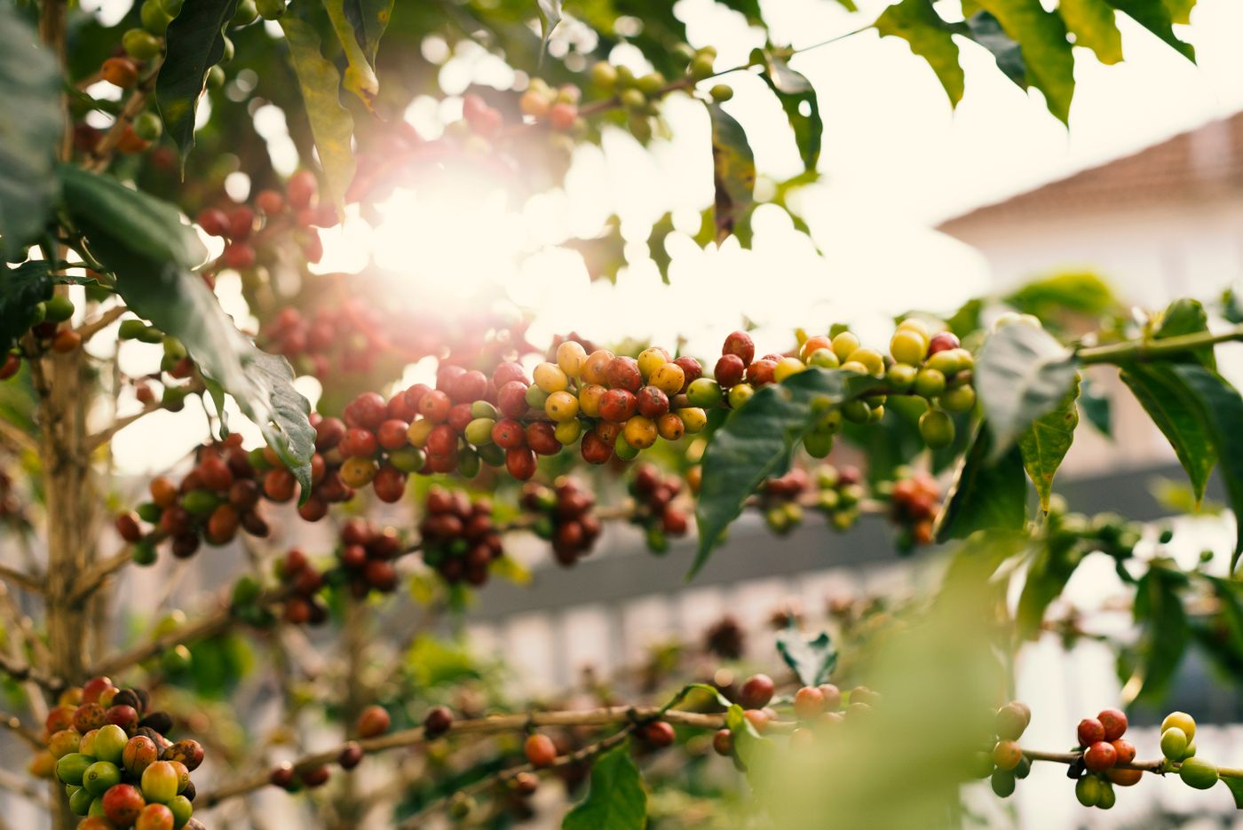 Low sun, backlit
 Hard light, real glass
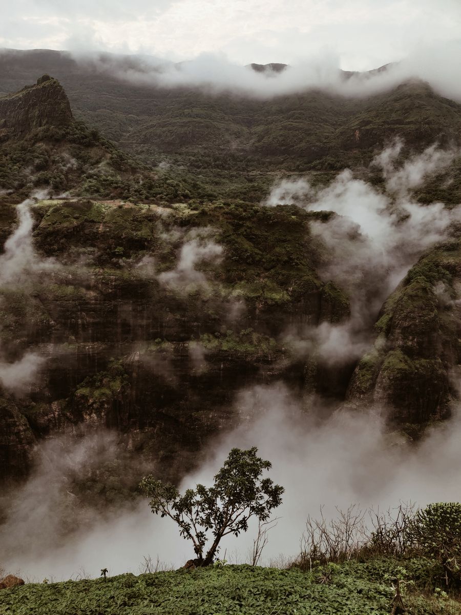 Weather, not scenery
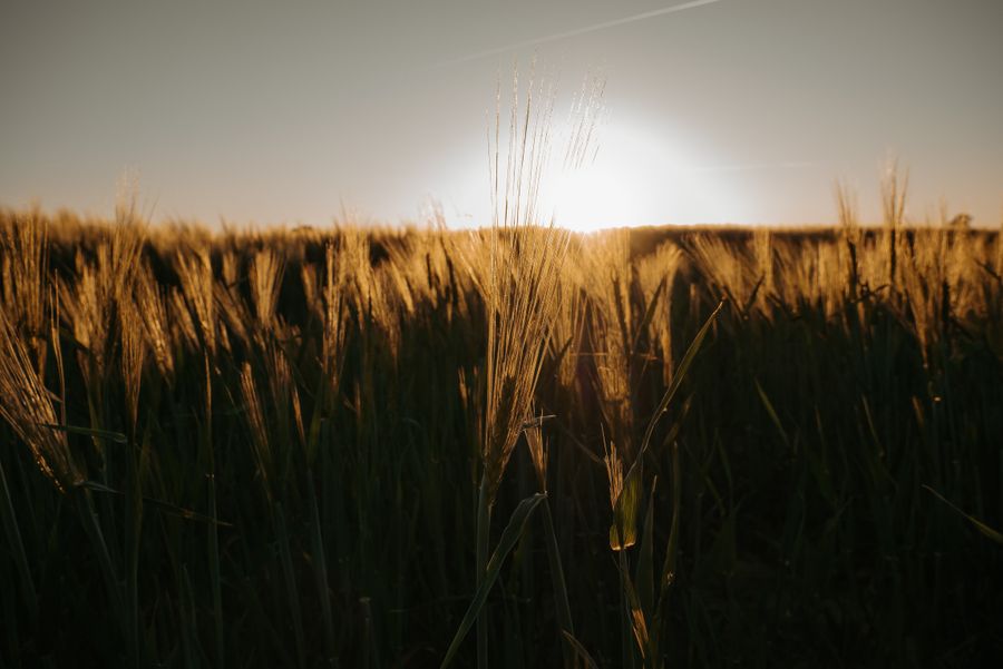 The oat field, golden hour
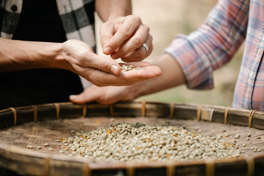 Hands, always
DoShoot in the first and last two hours of daylight. Let shadows fall. Keep people in the frame doing the thing they actually do.
Don'tNo studio white, no latte art, no lifestyle models laughing at salad. No filters that make Colombia look like a postcard of Colombia.
CropPortraits at 4:5 for cards, 3:4 for the process, 16:9 for clips. Captions in DM Mono, lower-left, on a cream pill.
The three labels, flat, exactly as they are wrapped around the can on the home page; and two things the identity wears when it goes outside.
 Slow steeped · Collingwood
Cold brew.
Eighteen hours.
No hurry.